A Website
for the Earth
Creative Direction
User Experience
Design
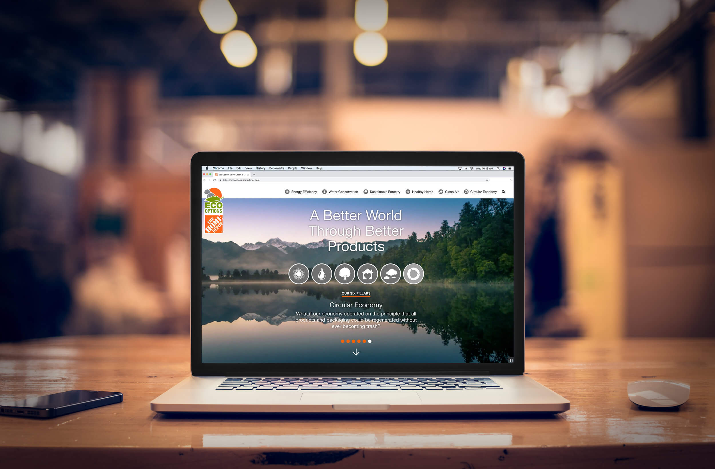
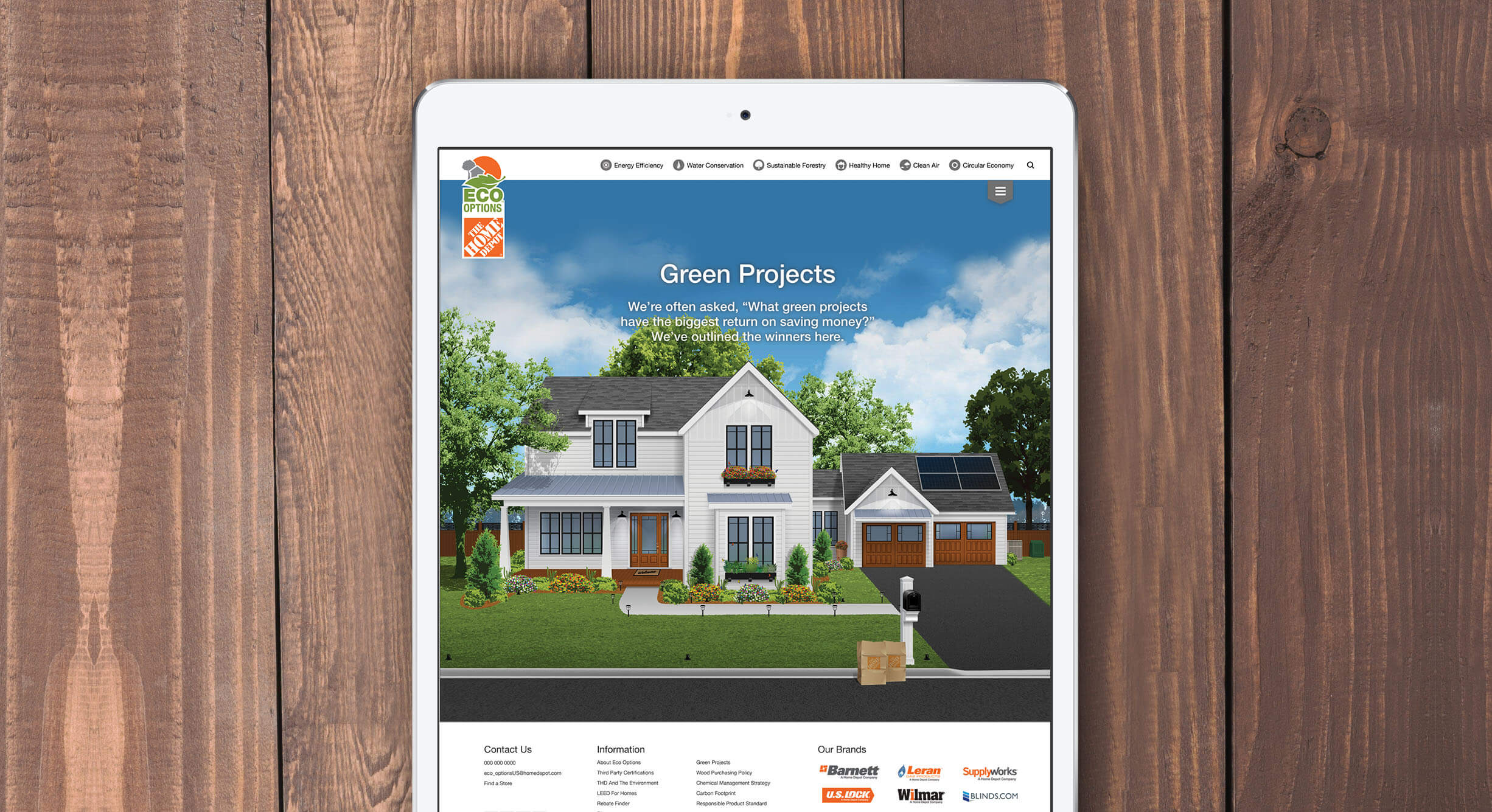
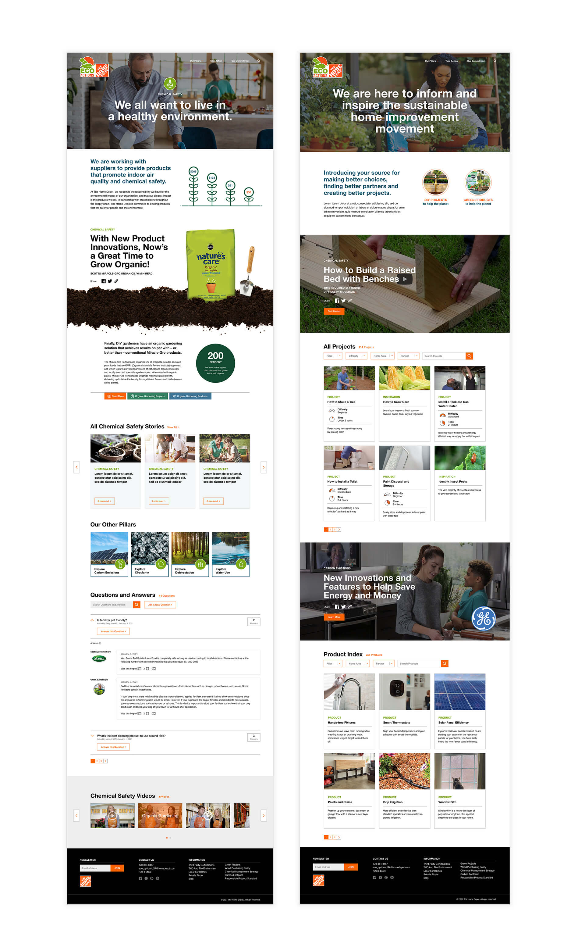
The Home Depot wanted to update their existing logo and website for Eco Options, a classification system that identifies products to help customers save energy and water, maintain healthier homes and conserve natural resources. The site got a full refresh of overall design, content and navigation to convey their “A Better World through Better Products” message while also keeping it easy for the internal Home Depot team to continually update (WordPress). This site was designed and developed with my friends at Porchlight.


